DATE
14/07/2024
It goes far beyond the drink itself. We built the TROP brand to play a leading role in the healthy lifestyles of Brazilians. Our goal was to create a visual identity that would break through the "niche product" barrier and transform kombucha into an object of desire—refreshing and accessible.
Packaging
Food & Beverage
Services
Branding and Visual Identity
Sector
Food and Beverage
Client
TROP Kombucha

Concept – Flavor Comes First
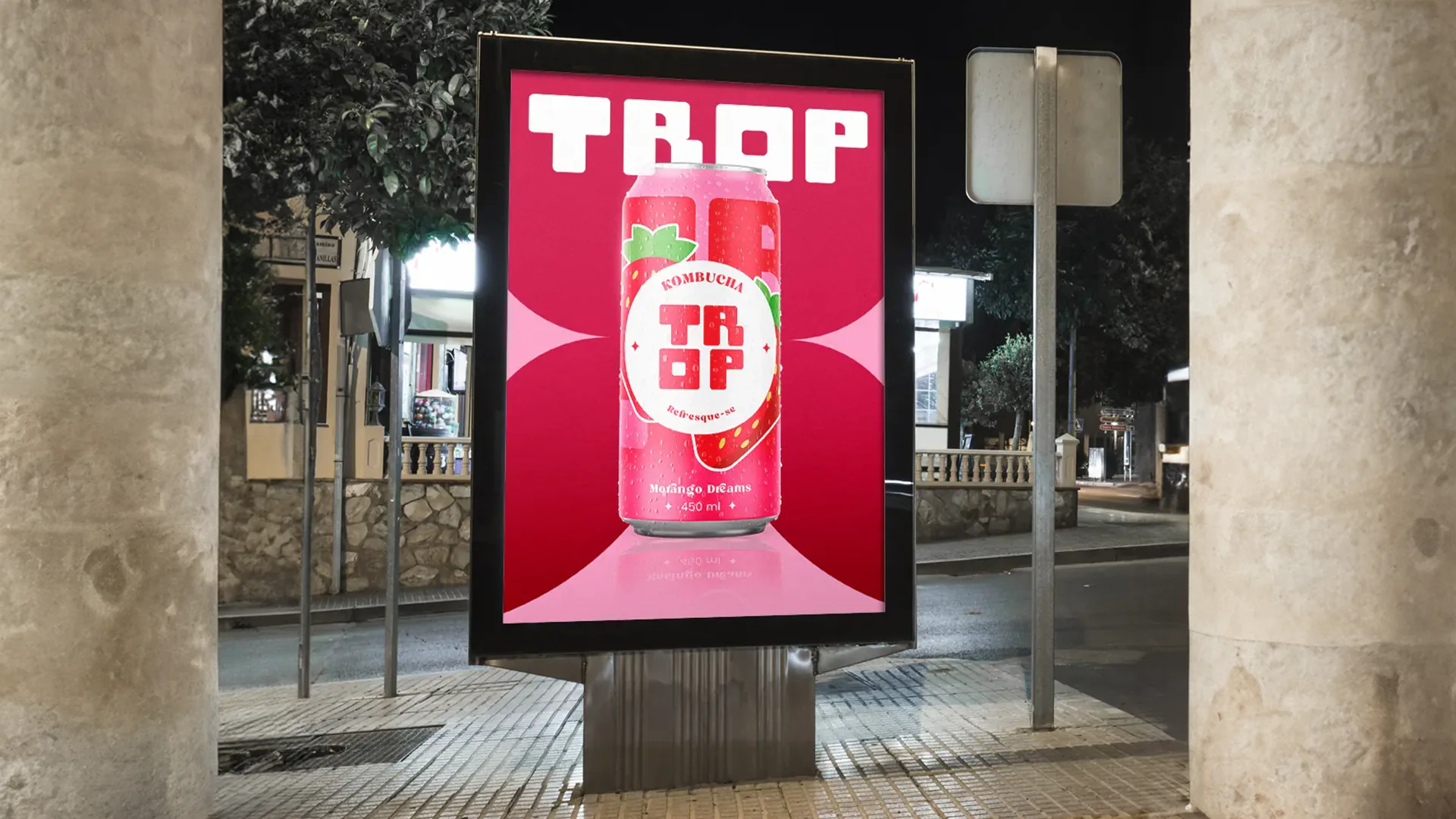
With a product so rich in benefits, selling "just" kombucha would be a waste. Our visual strategy was to highlight flavor and refreshment above all else, steering clear of the medicinal or "crunchy" aesthetic common in the category.
Packaging Design
LABEL
We developed a vibrant, straightforward label. Bold typography and flat fruit illustrations (as seen on the 'Strawberry Dreams' flavor) ensure the consumer instantly recognizes the flavor. It is a can designed to 'sout' from the shelf and spark immediate desire.
Vibrant Palette
We opted for saturated, cheerful colors to convey energy. The dominant pink isn't shy; it positions TROP as a fun, pop, and sociable drink—perfect for any time of day.


The Challenge: Democratizing Consumption
Kombucha is gaining popularity, yet it still raises questions. TROP’s challenge was to educate the public about the drink's benefits without being boring or overly technical. We needed to prove that being healthy can be delicious.
Positioning Strategy
STRATEGY
The danger was falling into the generic category of "dull fitness products." We positioned TROP as a lifestyle brand. The visual identity was crafted to communicate functional benefits in a lighthearted way, inviting a broader audience to try out this health routine.
The Solution – A Refreshing Universe
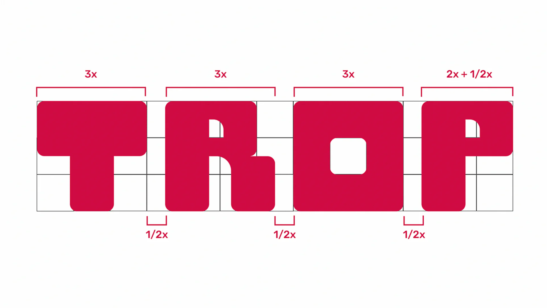
We delivered a visual identity system ready for both retail and digital environments. The TROP brand was born with a strong personality, ready to expand its flavor lineup without losing its essence.
Complete Visual Identity
BRANDING
We created a proprietary visual universe. From the striking logo to the benefit icons on the back of the can, every detail was designed to create a cohesive consumer experience. TROP is not just a drink; it is a visual benchmark of modern well-being.
See More Cases


FAQ
Why don’t you sell just a standalone logo?
How long does a complete project take?
Will I be able to edit my site later?
Do I need branding and website together?
What do I receive at the end of branding?
What payment options are available?